Button Widget
The Button is functionally identical to the Box — same
filled rounded rectangle, same optional border/icon/caption, even the same
built-in press-feedback animation (ugui_widget_button_set_anim() is a thin
wrapper over the box's ugui_widget_box_set_anim()). What it adds is its own
UGUI_TYPE_BUTTON type tag, so application code can tell a pressable control
from a decorative panel by type alone — at zero cost: the draw/event/tick
vtable entries for UGUI_TYPE_BUTTON point at the exact same functions as
UGUI_TYPE_BOX, and ugui_button_ext_t is a compile-time alias of
ugui_box_ext_t, so there is no duplicate Flash and no extra RAM per widget.
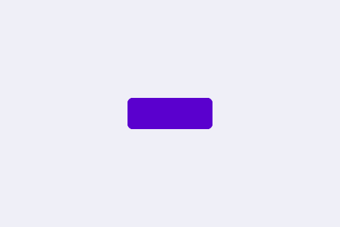
One default does differ from Box: a bare box sizes itself as a percentage of the screen width (so it scales with the panel), while a bare button defaults to a fixed 120×44 px regardless of panel size — see the first example below.
Every example below is complete — the file-scope storage, the callbacks and
the build calls — beside the exact frame it renders on a 480×320 panel. Each
compiles against nothing but the released library: drop it into the
Application Skeleton and it runs as-is. The icons come from
inc/icons/, the lexend fonts from inc/fonts/ — both ship with the library.
Examples
Default Button
A button created with nothing but ugui_widget_button_init(). It inherits every default: centred, 120×44, accent (purple) fill, rounded corners and no border. This is the baseline every other configuration builds on.
/* --- file-scope storage --- */
static ugui_screen_t  s_screen;
static ugui_widget_t   s_root;
static ugui_widget_t      s_demo_btn;
static ugui_button_ext_t  s_demo_btn_ext;

/* --- build it (in your screen's init) --- */
ugui_widget_button_init(&s_root, &s_demo_btn, &s_demo_btn_ext);   // Needed: the button
ugui_screen_add_widget(&s_screen, &s_demo_btn);  // Needed: register
Button with Text
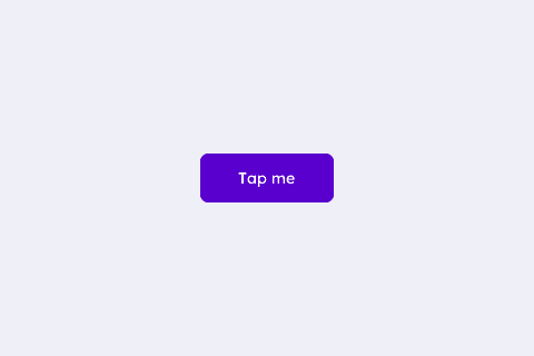
The default button with a centred caption and a click handler. Each tap rewrites the label through ugui_widget_button_update_text() — the label lives in a static buffer because update_text stores the pointer without copying it.
/* --- fonts: each is DEFINED in inc/fonts/<name>.h — #include that
 *     header in exactly one .c of your app; elsewhere just: --- */
extern const ugui_font_t lexend_14pt_2bpp;

/* --- file-scope storage --- */
static ugui_screen_t  s_screen;
static ugui_widget_t   s_root;
static ugui_widget_t      s_demo_btn;
static ugui_button_ext_t  s_demo_btn_ext;
static ugui_text_cfg_t    s_demo_text;
static char     s_label[24];
static uint32_t s_taps;

/* --- local helpers & event callbacks --- */
static void on_button_click(uint8_t widget_id, ugui_event_t event)
{
    (void)widget_id;
    if (event != UGUI_EVENT_CLICK) { return; }
    s_taps++;
#ifdef UGUI_ENABLE_FONT
    (void)snprintf(s_label, sizeof(s_label), "Tapped %lu", (unsigned long)s_taps);
    ugui_widget_button_update_text(&s_demo_btn, s_label);   // swap the label text
#endif
    printf("[button.text] tap #%lu\n", (unsigned long)s_taps);
}

/* --- build it (in your screen's init) --- */
ugui_widget_button_init(&s_root, &s_demo_btn, &s_demo_btn_ext);   // Needed: the button
#ifdef UGUI_ENABLE_FONT
ugui_text_cfg_init(&s_demo_text, "Tap me", &lexend_14pt_2bpp,
                   UGUI_THEME_KNOB, UGUI_ALIGN_CENTER, (ugui_point_t){ 0, 0 },
                   /*use_widget_area=*/1u);                       // Needed: caption cfg
ugui_widget_button_set_text(&s_demo_btn, &s_demo_text);           // Needed: attach text
#endif
/* Needed: deliver taps to on_button_click. CLICK is the logical press; DOWN/UP
 * + KEY_CONFIRM let touch and keypad both drive it. */
ugui_widget_set_event_cb(&s_demo_btn, on_button_click,
                         UGUI_EMASK_CLICK | UGUI_EMASK_DOWN | UGUI_EMASK_UP
                         | UGUI_EMASK_KEY_CONFIRM);
ugui_screen_add_widget(&s_screen, &s_demo_btn);  // Needed: register
#if UGUI_ENABLE_KEYPAD
ugui_screen_add_focus(&s_screen, &s_demo_btn);
#endif
Press Feedback
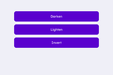
Three buttons, three press animations attached with ugui_widget_button_set_anim(): UGUI_ANIM_DARKEN, UGUI_ANIM_LIGHTEN and UGUI_ANIM_COLOR_INVERT. The effect fires on DOWN and restores on UP, so the event mask must include both. (Shown at rest — press to feel it.) This is the same animation engine a plain Box can attach with ugui_widget_box_set_anim() — Button just inherits it for free.
/* --- widget IDs: only need to be unique within the screen (10+ leaves
 *     room for the IDs your app already uses, e.g. the root's) --- */
enum {
    WDGT_ID_SLOT0 = 10, WDGT_ID_SLOT1, WDGT_ID_SLOT2
};

/* --- fonts: each is DEFINED in inc/fonts/<name>.h — #include that
 *     header in exactly one .c of your app; elsewhere just: --- */
extern const ugui_font_t lexend_14pt_2bpp;

/* --- file-scope storage --- */
static ugui_screen_t  s_screen;
static ugui_widget_t   s_root;
static ugui_widget_t      s_darken_btn;
static ugui_button_ext_t  s_darken_ext;
static ugui_text_cfg_t    s_darken_text;
static ugui_anim_cfg_t    s_darken_anim = {
    .type        = UGUI_ANIM_DARKEN,
    .param       = 35u,     /* darken the fill 35% on press */
    .duration_ms = 200u     /* fade back over 200 ms (animations build only) */
};
static ugui_widget_t      s_lighten_btn;
static ugui_button_ext_t  s_lighten_ext;
static ugui_text_cfg_t    s_lighten_text;
static ugui_anim_cfg_t    s_lighten_anim = {
    .type        = UGUI_ANIM_LIGHTEN,
    .param       = 45u,     /* lighten the fill 45% toward white on press */
    .duration_ms = 200u
};
static ugui_widget_t      s_invert_btn;
static ugui_button_ext_t  s_invert_ext;
static ugui_text_cfg_t    s_invert_text;
static ugui_anim_cfg_t    s_invert_anim = {
    .type        = UGUI_ANIM_COLOR_INVERT,
    .param       = 0u,      /* unused for INVERT */
    .duration_ms = 200u
};
#define BTN_X    60
#define BTN_W    (UGUI_SCREEN_W - 2 * BTN_X)
#define BTN_H    44
#define BTN0_Y   48
#define BTN_STEP (BTN_H + 12)
#define BTN1_Y   (BTN0_Y + 1 * BTN_STEP)
#define BTN2_Y   (BTN0_Y + 2 * BTN_STEP)

/* --- local helpers & event callbacks --- */
static void make_anim_button(ugui_widget_t* w, ugui_button_ext_t* ext,
                             ugui_text_cfg_t* text, ugui_anim_cfg_t* anim,
                             uint8_t id, int16_t y, const char* caption)
{
    ugui_widget_button_init(&s_root, w, ext);
    ugui_widget_set_area(w, BTN_X, y, BTN_W, BTN_H);
    ugui_widget_set_id  (w, id);
    ugui_widget_button_set_style(w, /*filled=*/true, 10u, 0u, UGUI_THEME_ACCENT, UGUI_THEME_ACCENT);
#ifdef UGUI_ENABLE_FONT
    ugui_text_cfg_init(text, caption, &lexend_14pt_2bpp, UGUI_THEME_KNOB,
                       UGUI_ALIGN_CENTER, (ugui_point_t){ 0, 0 }, /*use_widget_area=*/1u);
    ugui_widget_button_set_text(w, text);
#else
    (void)caption;
#endif
    /* Needed: attach the press animation + wire DOWN/UP so it actually fires.
     * No on_event callback — the effect is driven by the event mask alone. */
    ugui_widget_button_set_anim(w, anim);
    ugui_widget_set_event_cb(w, NULL,
                             UGUI_EMASK_DOWN | UGUI_EMASK_UP | UGUI_EMASK_KEY_CONFIRM);
    ugui_screen_add_widget(&s_screen, w);
#if UGUI_ENABLE_KEYPAD
    ugui_screen_add_focus(&s_screen, w);
#endif
}

/* --- build it (in your screen's init) --- */
make_anim_button(&s_darken_btn, &s_darken_ext, &s_darken_text, &s_darken_anim,
                 WDGT_ID_SLOT0, BTN0_Y, "Darken");
make_anim_button(&s_lighten_btn, &s_lighten_ext, &s_lighten_text, &s_lighten_anim,
                 WDGT_ID_SLOT1, BTN1_Y, "Lighten");
make_anim_button(&s_invert_btn, &s_invert_ext, &s_invert_text, &s_invert_anim,
                 WDGT_ID_SLOT2, BTN2_Y, "Invert");
Icon + Text
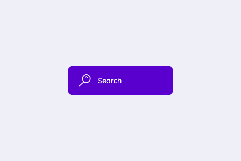
An icon button — a glyph on the left, a verb on the right. Icons attach with the Box helper ugui_widget_box_set_icon(): the button ext is the same type at the same union slot, so reusing it adds zero Flash.
/* --- image assets (inc/icons/ + inc/images/, shipped with the library;
 *     each header DEFINES its image — include it in ONE .c only) --- */
#ifdef UGUI_WIDGET_ENABLE_IMAGE
#include "icons/search_icon_1_grayscale_4.h"   /* defines img_search_icon_1 */
#endif

/* --- fonts: each is DEFINED in inc/fonts/<name>.h — #include that
 *     header in exactly one .c of your app; elsewhere just: --- */
extern const ugui_font_t lexend_14pt_2bpp;

/* --- file-scope storage --- */
static ugui_screen_t  s_screen;
static ugui_widget_t   s_root;
static ugui_widget_t      s_demo_btn;
static ugui_button_ext_t  s_demo_btn_ext;
static ugui_text_cfg_t    s_demo_text;
static ugui_anim_cfg_t    s_demo_anim = {
    .type        = UGUI_ANIM_DARKEN,
    .param       = 30u,
    .duration_ms = 180u
};
#define BTN_W   210
#define BTN_H   56
#define BTN_X   ((UGUI_SCREEN_W - BTN_W) / 2)
#define BTN_Y   ((UGUI_SCREEN_H - BTN_H) / 2)
#define BTN_FILL    UGUI_THEME_ACCENT
#define ICON_W  24
#define ICON_X  22
#define ICON_Y  ((BTN_H - ICON_W) / 2)
#define TEXT_X  (ICON_X + ICON_W + 14)          /* just past the icon */

/* --- local helpers & event callbacks --- */
static void on_button_click(uint8_t widget_id, ugui_event_t event)
{
    (void)widget_id;
    if (event == UGUI_EVENT_CLICK) { printf("[button.icon] Search pressed\n"); }
}

/* --- build it (in your screen's init) --- */
ugui_widget_button_init(&s_root, &s_demo_btn, &s_demo_btn_ext);    // Needed: the button
ugui_widget_set_area(&s_demo_btn, BTN_X, BTN_Y, BTN_W, BTN_H);     // Needed: room for icon+text
ugui_widget_button_set_style(&s_demo_btn, true, 10u, 0u, BTN_FILL, UGUI_THEME_ACCENT);
#ifdef UGUI_WIDGET_ENABLE_IMAGE
/* Icon via the BOX helper — button ext IS box ext (same slot). */
ugui_widget_box_set_icon(&s_demo_btn, &img_search_icon_1,
                         (ugui_point_t){ ICON_X, ICON_Y },
                         UGUI_COLOR_WHITE, BTN_FILL);              // Needed: the icon
#endif
#ifdef UGUI_ENABLE_FONT
/* Label sits in the region right of the icon (left-aligned, no overlap). */
ugui_text_cfg_init(&s_demo_text, "Search", &lexend_14pt_2bpp, UGUI_THEME_KNOB,
                   (ugui_align_t)(UGUI_ALIGN_LEFT | UGUI_ALIGN_V_CENTER),
                   (ugui_point_t){ 0, 0 }, /*use_widget_area=*/0u);
s_demo_text.area = (ugui_rect_t){ TEXT_X, 0, BTN_W - TEXT_X - 10, BTN_H };
ugui_widget_button_set_text(&s_demo_btn, &s_demo_text);           // Needed: the label
#endif
/* Needed: press animation + click handler so it behaves like a button. */
ugui_widget_button_set_anim(&s_demo_btn, &s_demo_anim);
ugui_widget_set_event_cb(&s_demo_btn, on_button_click,
                         UGUI_EMASK_CLICK | UGUI_EMASK_DOWN | UGUI_EMASK_UP
                         | UGUI_EMASK_KEY_CONFIRM);
ugui_screen_add_widget(&s_screen, &s_demo_btn);  // Needed: register
#if UGUI_ENABLE_KEYPAD
ugui_screen_add_focus(&s_screen, &s_demo_btn);
#endif
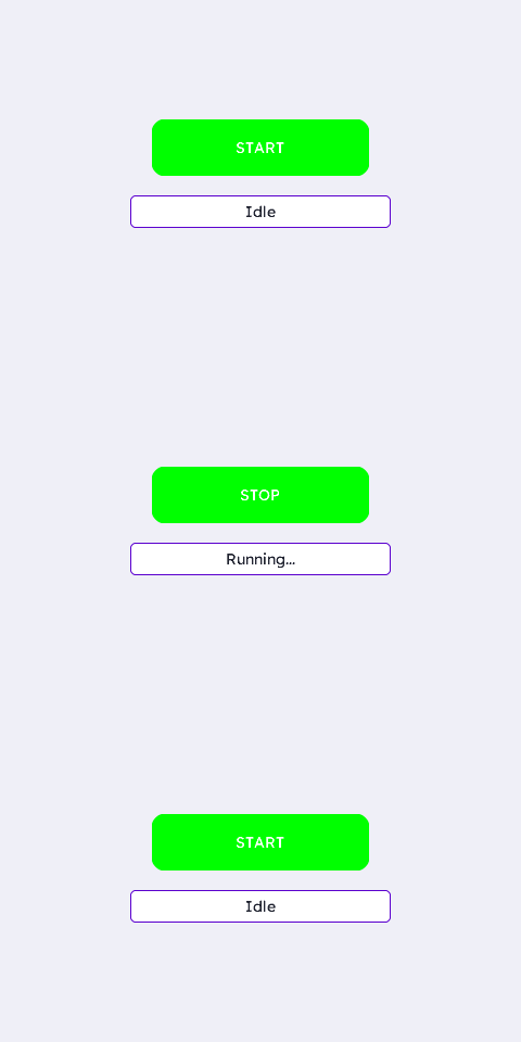
Action Button (toggle)
The everyday primary-action pattern: one button whose label and fill both flip on each tap (START ↔ STOP), with a status line echoing the state. Driven from the click handler with update_text + set_fill_color.
/* --- fonts: each is DEFINED in inc/fonts/<name>.h — #include that
 *     header in exactly one .c of your app; elsewhere just: --- */
extern const ugui_font_t lexend_14pt_2bpp;

/* --- file-scope storage --- */
static ugui_screen_t  s_screen;
static ugui_widget_t   s_root;
static ugui_widget_t      s_demo_btn;
static ugui_button_ext_t  s_demo_btn_ext;
static ugui_text_cfg_t    s_demo_text;
static ugui_anim_cfg_t    s_demo_anim = {
    .type        = UGUI_ANIM_DARKEN,
    .param       = 25u,
    .duration_ms = 160u
};
static ugui_widget_t   s_status_w;
static ugui_box_ext_t  s_status_ext;
static ugui_text_cfg_t s_status_text;
static bool         s_running;
static ugui_color_t s_col_start;   /* green */
static ugui_color_t s_col_stop;    /* red   */
#define BTN_W     200
#define BTN_H     52
#define STATUS_W  240
#define STATUS_H  30
#define BLOCK_GAP 18
#define BLOCK_H   (BTN_H + BLOCK_GAP + STATUS_H)
#define BTN_X     ((UGUI_SCREEN_W - BTN_W) / 2)
#define BTN_Y     ((UGUI_SCREEN_H - BLOCK_H) / 2)
#define STATUS_X  ((UGUI_SCREEN_W - STATUS_W) / 2)
#define STATUS_Y  (BTN_Y + BTN_H + BLOCK_GAP)

/* --- local helpers & event callbacks --- */
static void apply_state(void)
{
    const char* label  = s_running ? "STOP"      : "START";
    const char* status = s_running ? "Running..." : "Idle";
    ugui_widget_button_set_fill_color(&s_demo_btn, s_running ? s_col_stop : s_col_start);
#ifdef UGUI_ENABLE_FONT
    ugui_widget_button_update_text(&s_demo_btn, label);
    ugui_widget_box_update_text_str(&s_status_w, status);
#else
    (void)label; (void)status;
#endif
}

static void on_button_click(uint8_t widget_id, ugui_event_t event)
{
    (void)widget_id;
    if (event != UGUI_EVENT_CLICK) { return; }
    s_running = !s_running;
    apply_state();
    printf("[button.toggle] %s\n", s_running ? "RUNNING" : "IDLE");
}

/* --- build it (in your screen's init) --- */
s_running   = false;               // Needed: start idle (START shown)
s_col_start = UGUI_COLOR_GREEN;    // Needed: the two fills the click handler
s_col_stop  = UGUI_COLOR_RED;      //         flips between (runtime-seeded)
ugui_widget_button_init(&s_root, &s_demo_btn, &s_demo_btn_ext);   // Needed: the button
ugui_widget_set_area(&s_demo_btn, BTN_X, BTN_Y, BTN_W, BTN_H);    // Needed
ugui_widget_button_set_style(&s_demo_btn, true, 12u, 0u, s_col_start, UGUI_THEME_ACCENT);
#ifdef UGUI_ENABLE_FONT
ugui_text_cfg_init(&s_demo_text, "START", &lexend_14pt_2bpp, UGUI_COLOR_WHITE,
                   UGUI_ALIGN_CENTER, (ugui_point_t){ 0, 0 }, /*use_widget_area=*/1u);
ugui_widget_button_set_text(&s_demo_btn, &s_demo_text);
#endif
ugui_widget_button_set_anim(&s_demo_btn, &s_demo_anim);
ugui_widget_set_event_cb(&s_demo_btn, on_button_click,
                         UGUI_EMASK_CLICK | UGUI_EMASK_DOWN | UGUI_EMASK_UP
                         | UGUI_EMASK_KEY_CONFIRM);
ugui_screen_add_widget(&s_screen, &s_demo_btn);   // Needed: register
#if UGUI_ENABLE_KEYPAD
ugui_screen_add_focus(&s_screen, &s_demo_btn);
#endif

/* Status box: a plain box (NOT a button) that reflects the last action. */
ugui_widget_box_init(&s_root, &s_status_w, &s_status_ext);
ugui_widget_set_area(&s_status_w, STATUS_X, STATUS_Y, STATUS_W, STATUS_H);
ugui_widget_box_set_style(&s_status_w, true, 6u, 1u, UGUI_THEME_SURFACE, UGUI_THEME_ACCENT);
#ifdef UGUI_ENABLE_FONT
ugui_text_cfg_init(&s_status_text, "Idle", &lexend_14pt_2bpp, UGUI_THEME_TEXT,
                   UGUI_ALIGN_CENTER, (ugui_point_t){ 0, 0 }, 1u);
ugui_widget_box_set_text(&s_status_w, &s_status_text);
#endif
ugui_screen_add_widget(&s_screen, &s_status_w);
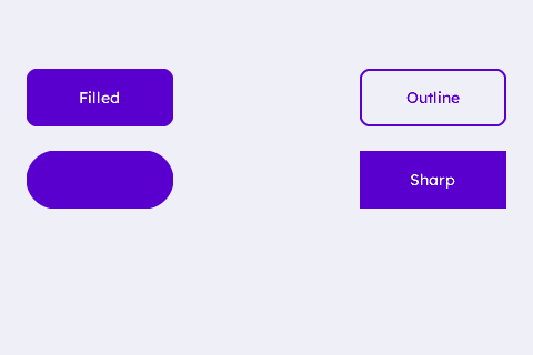
Style Variations
The same ugui_widget_button_set_style() call with four argument sets: filled, outline (border only), pill (radius ≥ height/2) and sharp (radius 0 — square corners).
/* --- widget IDs: only need to be unique within the screen (10+ leaves
 *     room for the IDs your app already uses, e.g. the root's) --- */
enum {
    WDGT_ID_SLOT0 = 10, WDGT_ID_SLOT1, WDGT_ID_SLOT2,
    WDGT_ID_SLOT3
};

/* --- fonts: each is DEFINED in inc/fonts/<name>.h — #include that
 *     header in exactly one .c of your app; elsewhere just: --- */
extern const ugui_font_t lexend_14pt_2bpp;

/* --- file-scope storage --- */
static ugui_screen_t  s_screen;
static ugui_widget_t   s_root;
#define BTN_COUNT 4u
static ugui_widget_t      s_btn[BTN_COUNT];
static ugui_button_ext_t  s_btn_ext[BTN_COUNT];
static ugui_text_cfg_t    s_btn_text[BTN_COUNT];
static ugui_anim_cfg_t    s_anim = {
    .type        = UGUI_ANIM_DARKEN,
    .param       = 30u,
    .duration_ms = 180u
};
#define BTN_W    132
#define BTN_H    52
#define COL0_X   24
#define COL1_X   (UGUI_SCREEN_W - COL0_X - BTN_W)
#define ROW0_Y   62
#define ROW1_Y   (ROW0_Y + BTN_H + 22)

/* --- local helpers & event callbacks --- */
static void on_button_click(uint8_t widget_id, ugui_event_t event)
{
    if (event == UGUI_EVENT_CLICK) {
        printf("[button.styles] slot %u pressed\n", (unsigned)widget_id);
    }
}

static void make_button(uint8_t idx, uint8_t id, int16_t x, int16_t y,
                        bool filled, uint8_t radius, uint8_t border_w,
                        const char* caption, ugui_color_t text_color)
{
    ugui_widget_button_init(&s_root, &s_btn[idx], &s_btn_ext[idx]);
    ugui_widget_set_area(&s_btn[idx], x, y, BTN_W, BTN_H);
    ugui_widget_set_id  (&s_btn[idx], id);
    ugui_widget_button_set_style(&s_btn[idx], filled, radius, border_w,
                                 UGUI_THEME_ACCENT, UGUI_THEME_ACCENT);
#ifdef UGUI_ENABLE_FONT
    ugui_text_cfg_init(&s_btn_text[idx], caption, &lexend_14pt_2bpp, text_color,
                       UGUI_ALIGN_CENTER, (ugui_point_t){ 0, 0 }, /*use_widget_area=*/1u);
    ugui_widget_button_set_text(&s_btn[idx], &s_btn_text[idx]);
#else
    (void)caption; (void)text_color;
#endif
    ugui_widget_button_set_anim(&s_btn[idx], &s_anim);
    ugui_widget_set_event_cb(&s_btn[idx], on_button_click,
                             UGUI_EMASK_CLICK | UGUI_EMASK_DOWN | UGUI_EMASK_UP
                             | UGUI_EMASK_KEY_CONFIRM);
    ugui_screen_add_widget(&s_screen, &s_btn[idx]);
#if UGUI_ENABLE_KEYPAD
    ugui_screen_add_focus(&s_screen, &s_btn[idx]);
#endif
}

/* --- build it (in your screen's init) --- */
/* Filled — solid rounded (white label on accent). */
make_button(0u, WDGT_ID_SLOT0, COL0_X, ROW0_Y, /*filled=*/true,  10u, 0u,
            "Filled", UGUI_THEME_KNOB);
/* Outline — border only; the page shows through, so use accent-coloured text. */
make_button(1u, WDGT_ID_SLOT1, COL1_X, ROW0_Y, /*filled=*/false, 10u, 2u,
            "Outline", UGUI_THEME_ACCENT);
/* Pill — radius >= height/2 rounds the ends into a capsule. */
make_button(2u, WDGT_ID_SLOT2, COL0_X, ROW1_Y, /*filled=*/true,  (uint8_t)(BTN_H / 2), 0u,
            "Pill", UGUI_THEME_KNOB);
/* Sharp — radius 0 keeps square corners. */
make_button(3u, WDGT_ID_SLOT3, COL1_X, ROW1_Y, /*filled=*/true,  0u, 0u,
            "Sharp", UGUI_THEME_KNOB);
From this widget to a working app
Everything above is the widget-specific code. The scaffolding it drops into — storage, HAL, main loop, display-mode bring-up — is the same for every app: copy it from the Application Skeleton.