Box Widget
The Box is μGUI's most fundamental widget — a rounded rectangle that works as a button, a panel, a card, or a container for other widgets. Boxes support a fill colour, a themed border, rounded corners, an optional centred icon and caption, click handling and a built-in press animation.
Every example below is complete — the file-scope storage, the callbacks and
the build calls — beside the exact frame it renders on a 480×320 panel. Each
compiles against nothing but the released library: drop it into the
Application Skeleton and it runs as-is. The icons come from
inc/icons/, the lexend fonts from inc/fonts/ — both ship with the library.
Examples
Default Box
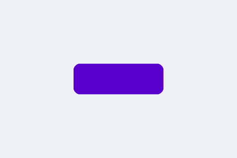
A box created with nothing but ugui_widget_box_init(). It inherits every default from the library: centred, sized as a percentage of the screen width, accent (purple) fill, a 1 px themed border and rounded corners. This is the baseline every other configuration builds on.
/* --- file-scope storage --- */
static ugui_screen_t  s_screen;
static ugui_widget_t   s_root;
static ugui_widget_t  s_demo_box;
static ugui_box_ext_t s_demo_box_ext;

/* --- build it (in your screen's init) --- */
ugui_widget_box_init(&s_root, &s_demo_box, &s_demo_box_ext);
ugui_screen_add_widget(&s_screen, &s_demo_box);
Box with Text
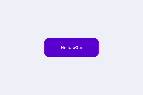
The default box with a centred caption attached through ugui_widget_box_set_text(). The box geometry stays at the library default; only the label is added.
/* --- fonts: each is DEFINED in inc/fonts/<name>.h — #include that
 *     header in exactly one .c of your app; elsewhere just: --- */
extern const ugui_font_t lexend_14pt_2bpp;

/* --- file-scope storage --- */
static ugui_screen_t  s_screen;
static ugui_widget_t   s_root;
static ugui_widget_t   s_demo_box;
static ugui_box_ext_t  s_demo_box_ext;
static ugui_text_cfg_t s_demo_text;

/* --- build it (in your screen's init) --- */
ugui_widget_box_init(&s_root, &s_demo_box, &s_demo_box_ext);     // Needed: the box
#ifdef UGUI_ENABLE_FONT
ugui_text_cfg_init(&s_demo_text, "Hello uGui", &lexend_14pt_2bpp,
                   UGUI_THEME_KNOB, UGUI_ALIGN_CENTER, (ugui_point_t){ 0, 0 },
                   /*use_widget_area=*/1u);                       // Needed: caption cfg
ugui_widget_box_set_text(&s_demo_box, &s_demo_text);             // Needed: attach text
#endif
ugui_screen_add_widget(&s_screen, &s_demo_box);  // Needed: register
Box with Image
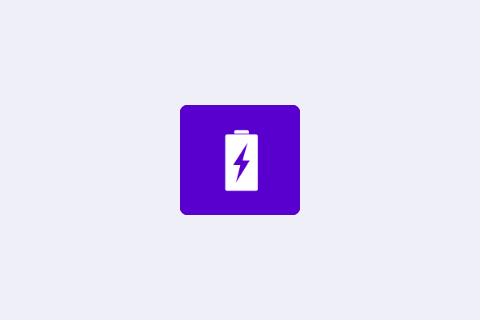
A sized box with a centred icon set via ugui_widget_box_set_icon(). Wiring DOWN/UP events lets the box's built-in press animation react to touch.
/* --- image assets (inc/icons/ + inc/images/, shipped with the library;
 *     each header DEFINES its image — include it in ONE .c only) --- */
#ifdef UGUI_WIDGET_ENABLE_IMAGE
#include "images/ugui_battery.h"   /* defines img_battery */
#endif

/* --- fonts: each is DEFINED in inc/fonts/<name>.h — #include that
 *     header in exactly one .c of your app; elsewhere just: --- */
extern const ugui_font_t lexend_14pt_2bpp;

/* --- file-scope storage --- */
static ugui_screen_t  s_screen;
static ugui_widget_t   s_root;
static ugui_widget_t   s_demo_box;
static ugui_box_ext_t  s_demo_box_ext;
static ugui_text_cfg_t s_no_img_text;   /* fallback when images are disabled */
static ugui_anim_cfg_t s_demo_box_anim = {
    .type        = UGUI_ANIM_COLOR_INVERT,
    .duration_ms = 200u
};
#define BOX_W   120
#define BOX_H   110
#define BOX_X   ((UGUI_SCREEN_W - BOX_W) / 2)
#define BOX_Y   ((UGUI_SCREEN_H - BOX_H) / 2)
#define BOX_FILL  UGUI_THEME_ACCENT

/* --- build it (in your screen's init) --- */
ugui_widget_box_init(&s_root, &s_demo_box, &s_demo_box_ext);      // Needed: the box
ugui_widget_set_area(&s_demo_box, BOX_X, BOX_Y, BOX_W, BOX_H);    // Needed: room for the icon
ugui_widget_box_set_style(&s_demo_box, true, 8u, 1u, BOX_FILL, UGUI_THEME_ACCENT);
#ifdef UGUI_WIDGET_ENABLE_IMAGE
/* Centre the 58x78 icon inside the box. */
ugui_widget_box_set_icon(&s_demo_box, &img_battery,
                         (ugui_point_t){ (BOX_W - 58) / 2, (BOX_H - 78) / 2 },
                         UGUI_COLOR_WHITE, BOX_FILL);              // Needed: the icon
#else
ugui_text_cfg_init(&s_no_img_text, "no image build", &lexend_14pt_2bpp,
                   UGUI_THEME_KNOB, UGUI_ALIGN_CENTER, (ugui_point_t){ 0, 0 }, 1u);
ugui_widget_box_set_text(&s_demo_box, &s_no_img_text);
#endif
/* Needed: wire DOWN/UP so ugui_box_on_event() actually fires; the
 * animation engine is dead weight without an event_mask to trigger it. */
ugui_widget_box_set_anim(&s_demo_box, &s_demo_box_anim);
ugui_widget_set_event_cb(&s_demo_box, NULL, UGUI_EMASK_DOWN | UGUI_EMASK_UP);
ugui_screen_add_widget(&s_screen, &s_demo_box);  // Needed: register
Icon + Label (tap to cycle)
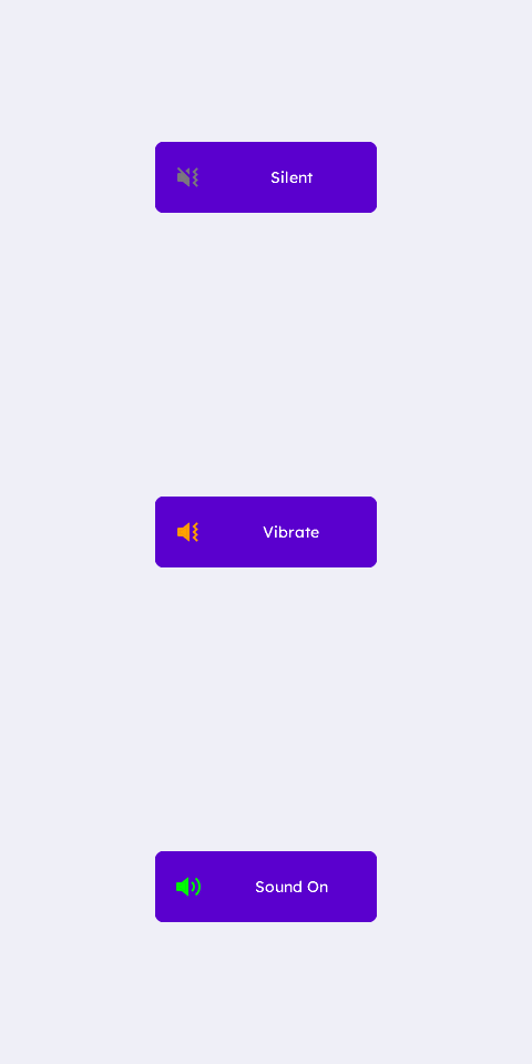
An icon and a label side by side inside one box. The box is clickable — each tap cycles the ringer state, swapping the icon, the tint and the caption.
/* --- image assets (inc/icons/ + inc/images/, shipped with the library;
 *     each header DEFINES its image — include it in ONE .c only) --- */
#ifdef UGUI_WIDGET_ENABLE_IMAGE
#include "icons/volume_icon_1_off_vibrate_grayscale_4.h"   /* defines img_volume_icon_1_off_vibrate */
#include "icons/volume_icon_1_up_grayscale_4.h"   /* defines img_volume_icon_1_up */
#include "icons/volume_icon_1_vibrate_grayscale_4.h"   /* defines img_volume_icon_1_vibrate */
#endif

/* --- fonts: each is DEFINED in inc/fonts/<name>.h — #include that
 *     header in exactly one .c of your app; elsewhere just: --- */
extern const ugui_font_t lexend_14pt_2bpp;

/* --- file-scope storage --- */
static ugui_screen_t  s_screen;
static ugui_widget_t   s_root;
static ugui_widget_t   s_demo_box;
static ugui_box_ext_t  s_demo_box_ext;
static ugui_text_cfg_t s_demo_text;
#define BOX_W   200
#define BOX_H   64
#define BOX_X   ((UGUI_SCREEN_W - BOX_W) / 2)
#define BOX_Y   ((UGUI_SCREEN_H - BOX_H) / 2)
#define BOX_FILL    UGUI_THEME_ACCENT
#define ICON_W  24
#define ICON_X  18
#define ICON_Y  ((BOX_H - ICON_W) / 2)
#define TEXT_X  (ICON_X + ICON_W + 14)           /* just past the icon */
#define STATE_COUNT 3u
static const char* const s_labels[STATE_COUNT] = { "Silent", "Vibrate", "Sound On" };
static const ugui_compressed_image_t* const s_icons[STATE_COUNT] = {
    &img_volume_icon_1_off_vibrate,
    &img_volume_icon_1_vibrate,
    &img_volume_icon_1_up,
};
static ugui_color_t s_tints[STATE_COUNT];
static uint8_t s_state;

/* --- local helpers & event callbacks --- */
static void apply_state(void)
{
#ifdef UGUI_WIDGET_ENABLE_IMAGE
    ugui_widget_box_set_icon(&s_demo_box, s_icons[s_state],
                             (ugui_point_t){ ICON_X, ICON_Y },
                             s_tints[s_state], BOX_FILL);
#endif
#ifdef UGUI_ENABLE_FONT
    ugui_widget_box_update_text_str(&s_demo_box, s_labels[s_state]);
#endif
    ugui_widget_invalidate(&s_demo_box);   /* ensure the box redraws */
}

static void on_box_click(uint8_t widget_id, ugui_event_t event)
{
    (void)widget_id;
    if (event != UGUI_EVENT_CLICK) { return; }
    s_state = (uint8_t)((s_state + 1u) % STATE_COUNT);
    apply_state();
    printf("[box.img+txt] state -> %s\n", s_labels[s_state]);
}

/* --- build it (in your screen's init) --- */
s_state = 0u;     // Needed: start on "Silent"
#ifdef UGUI_WIDGET_ENABLE_IMAGE
/* Needed: tints are UGUI_RGB compound literals -> seeded at runtime. */
s_tints[0] = UGUI_COLOR_GRAY;    /* Silent   */
s_tints[1] = UGUI_COLOR_AMBER;   /* Vibrate  */
s_tints[2] = UGUI_COLOR_GREEN;   /* Sound On */
#endif
ugui_widget_box_init(&s_root, &s_demo_box, &s_demo_box_ext);      // Needed: the box
ugui_widget_set_area(&s_demo_box, BOX_X, BOX_Y, BOX_W, BOX_H);    // Needed
ugui_widget_box_set_style(&s_demo_box, true, 8u, 1u, BOX_FILL, UGUI_THEME_ACCENT);
#ifdef UGUI_ENABLE_FONT
/* Label sits in the region to the right of the icon (no overlap). */
ugui_text_cfg_init(&s_demo_text, s_labels[0], &lexend_14pt_2bpp,
                   UGUI_THEME_KNOB, UGUI_ALIGN_CENTER, (ugui_point_t){ 0, 0 },
                   /*use_widget_area=*/0u);
s_demo_text.area = (ugui_rect_t){ TEXT_X, (BOX_H - 22) / 2,
                                  BOX_W - TEXT_X - 10, 22 };
ugui_widget_box_set_text(&s_demo_box, &s_demo_text);
#endif
apply_state();   // Needed: seed icon + tint + label for state 0
/* Needed: make the box clickable so a tap cycles the ringer state. */
ugui_widget_set_event_cb(&s_demo_box, on_box_click,
                         UGUI_EMASK_CLICK | UGUI_EMASK_DOWN | UGUI_EMASK_UP
                         | UGUI_EMASK_KEY_CONFIRM);
ugui_screen_add_widget(&s_screen, &s_demo_box);   // Needed: register
#if UGUI_ENABLE_KEYPAD
ugui_screen_add_focus(&s_screen, &s_demo_box);
#endif
Clickable Box (tap to recolour)
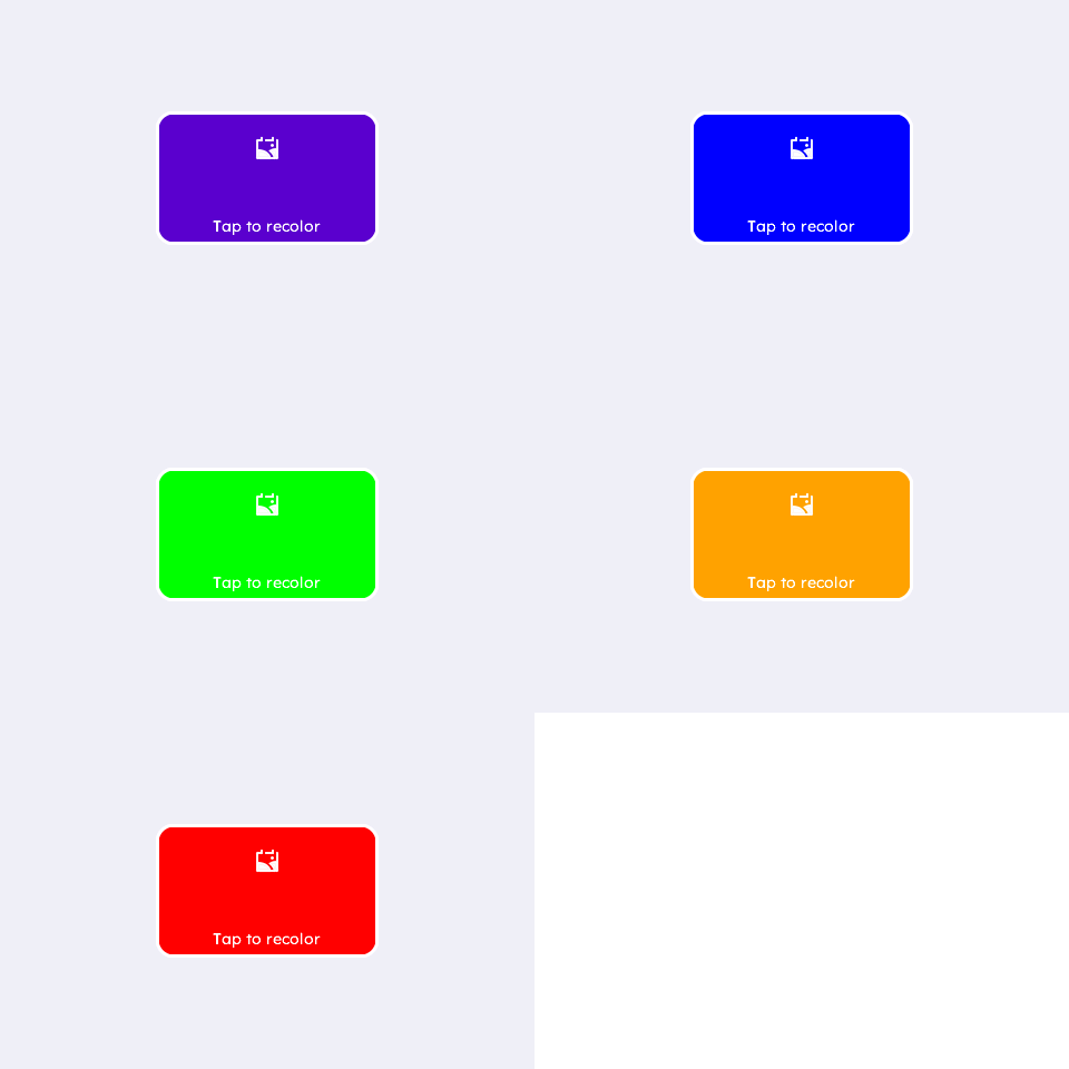
A fully custom box — every property is set explicitly, nothing relies on defaults. A click handler recolours the fill on each tap.
/* --- image assets (inc/icons/ + inc/images/, shipped with the library;
 *     each header DEFINES its image — include it in ONE .c only) --- */
#ifdef UGUI_WIDGET_ENABLE_IMAGE
#include "icons/gallery_icon_1_grayscale_4.h"   /* defines img_gallery_icon_1 */
#endif

/* --- fonts: each is DEFINED in inc/fonts/<name>.h — #include that
 *     header in exactly one .c of your app; elsewhere just: --- */
extern const ugui_font_t lexend_14pt_2bpp;

/* --- file-scope storage --- */
static ugui_screen_t  s_screen;
static ugui_widget_t   s_root;
static ugui_widget_t   s_demo_box;
static ugui_box_ext_t  s_demo_box_ext;
static ugui_text_cfg_t s_demo_text;
#define BOX_W   200
#define BOX_H   120
#define BOX_X   ((UGUI_SCREEN_W - BOX_W) / 2)
#define BOX_Y   ((UGUI_SCREEN_H - BOX_H) / 2)
#define BOX_RADIUS   16u
#define BOX_BORDER_W  3u
#define ICON_W  24
#define ICON_X  ((BOX_W - ICON_W) / 2)
#define ICON_Y  22
#define FILL_COUNT 5u
static ugui_color_t s_fills[FILL_COUNT];
static uint8_t s_fill_idx;

/* --- local helpers & event callbacks --- */
static void on_box_click(uint8_t widget_id, ugui_event_t event)
{
    (void)widget_id;
    if (event != UGUI_EVENT_CLICK) { return; }

    s_fill_idx = (uint8_t)((s_fill_idx + 1u) % FILL_COUNT);
    const ugui_color_t c = s_fills[s_fill_idx];
    ugui_widget_box_set_fill_color(&s_demo_box, c);
#ifdef UGUI_WIDGET_ENABLE_IMAGE
    ugui_widget_box_set_icon(&s_demo_box, &img_gallery_icon_1,
                             (ugui_point_t){ ICON_X, ICON_Y },
                             UGUI_COLOR_WHITE, c);   /* bg follows the new fill */
#endif
    printf("[box.click] fill -> %u/%u\n", (unsigned)(s_fill_idx + 1u),
           (unsigned)FILL_COUNT);
}

/* --- build it (in your screen's init) --- */
/* Needed: the click-cycled palette (seeded at runtime — the UGUI_COLOR_*
 * presets are compound literals, not file-scope constant expressions). */
s_fills[0] = UGUI_COLOR_PURPLE;
s_fills[1] = UGUI_COLOR_BLUE;
s_fills[2] = UGUI_COLOR_GREEN;
s_fills[3] = UGUI_COLOR_AMBER;
s_fills[4] = UGUI_COLOR_RED;
ugui_widget_box_init(&s_root, &s_demo_box, &s_demo_box_ext);          // Needed
ugui_widget_set_area(&s_demo_box, BOX_X, BOX_Y, BOX_W, BOX_H);        // Needed: geometry
ugui_widget_box_set_style(&s_demo_box, /*filled=*/true, BOX_RADIUS,
                          BOX_BORDER_W, s_fills[0], UGUI_THEME_KNOB);   // Needed: full style
#ifdef UGUI_WIDGET_ENABLE_IMAGE
ugui_widget_box_set_icon(&s_demo_box, &img_gallery_icon_1,
                         (ugui_point_t){ ICON_X, ICON_Y },
                         UGUI_COLOR_WHITE, s_fills[0]);                // icon (top)
#endif
#ifdef UGUI_ENABLE_FONT
ugui_text_cfg_init(&s_demo_text, "Tap to recolor", &lexend_14pt_2bpp,
                   UGUI_THEME_KNOB, UGUI_ALIGN_CENTER, (ugui_point_t){ 0, 0 },
                   /*use_widget_area=*/0u);                            // label (bottom)
s_demo_text.area = (ugui_rect_t){ 8, BOX_H - 28, BOX_W - 16, 22 };
ugui_widget_box_set_text(&s_demo_box, &s_demo_text);
#endif
/* Needed: make the box clickable and route taps to on_box_click. */
ugui_widget_set_event_cb(&s_demo_box, on_box_click,
                         UGUI_EMASK_CLICK | UGUI_EMASK_DOWN | UGUI_EMASK_UP
                         | UGUI_EMASK_KEY_CONFIRM);
ugui_screen_add_widget(&s_screen, &s_demo_box);  // Needed: register
#if UGUI_ENABLE_KEYPAD
ugui_screen_add_focus(&s_screen, &s_demo_box);
#endif
Box as a Container
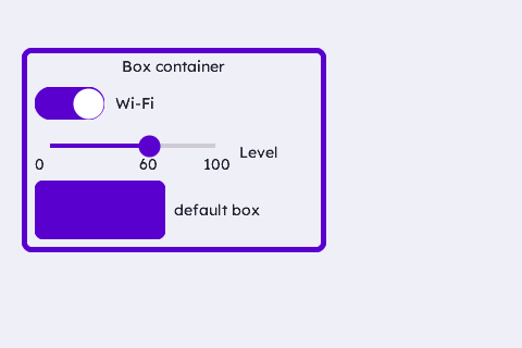
A box used as a panel that parents other widgets — a header label, a toggle, a slider and a nested default box. Child coordinates are relative to the container's top-left corner.
/* --- widget IDs: only need to be unique within the screen (10+ leaves
 *     room for the IDs your app already uses, e.g. the root's) --- */
enum {
    WDGT_ID_HEADER = 10, WDGT_ID_TOGGLE, WDGT_ID_TOGGLE_LBL,
    WDGT_ID_SLIDER, WDGT_ID_SLIDER_LBL, WDGT_ID_NESTED_BOX,
    WDGT_ID_NESTED_LBL
};

/* --- fonts: each is DEFINED in inc/fonts/<name>.h — #include that
 *     header in exactly one .c of your app; elsewhere just: --- */
extern const ugui_font_t lexend_14pt_2bpp;

/* --- file-scope storage --- */
static ugui_screen_t  s_screen;
static ugui_widget_t   s_root;
static ugui_widget_t   s_container;
static ugui_box_ext_t  s_container_ext;
static ugui_widget_t     s_header;     static ugui_label_ext_t  s_header_ext;
static ugui_widget_t     s_toggle;     static ugui_toggle_ext_t s_toggle_ext;
static ugui_widget_t     s_toggle_lbl; static ugui_label_ext_t  s_toggle_lbl_ext;
static ugui_widget_t     s_slider;     static ugui_slider_ext_t s_slider_ext;
static ugui_widget_t     s_slider_lbl; static ugui_label_ext_t  s_slider_lbl_ext;
static ugui_widget_t     s_nested_box; static ugui_box_ext_t    s_nested_box_ext;
static ugui_widget_t     s_nested_lbl; static ugui_label_ext_t  s_nested_lbl_ext;
#define BOX_X   20
#define BOX_Y   44
#define BOX_W   280
#define BOX_H   188
#define LBL_ALIGN  ((ugui_align_t)(UGUI_ALIGN_LEFT | UGUI_ALIGN_V_CENTER))

/* --- local helpers & event callbacks --- */
static void add_label(ugui_widget_t* w, ugui_label_ext_t* ext, uint8_t id,
                      int16_t x, int16_t y, int16_t cw, int16_t ch,
                      const char* str, ugui_align_t align)
{
    ugui_widget_label_init(&s_container, w, ext);
    ugui_widget_set_area(w, x, y, cw, ch);
    ugui_widget_set_id  (w, id);
    ugui_widget_label_set_style(w, /*bg_fill=*/false, UGUI_THEME_BG, str,
                                &lexend_14pt_2bpp, UGUI_THEME_TEXT, align, 1u);
    ugui_screen_add_widget(&s_screen, w);
}

/* --- build it (in your screen's init) --- */
ugui_widget_box_init(&s_root, &s_container, &s_container_ext);    // Needed
ugui_widget_set_area(&s_container, BOX_X, BOX_Y, BOX_W, BOX_H);   // Needed
/* Container filled with the page bg (delineated by its accent border) so the
 * child toggle/slider — whose default OFF/ON colours are surface/accent —
 * both stay visible in dark and light themes. */
ugui_widget_box_set_style(&s_container, true, 10u, 5u, UGUI_THEME_BG, UGUI_THEME_ACCENT);
ugui_screen_add_widget(&s_screen, &s_container);

/* Header (child coords are relative to the container's top-left). */
add_label(&s_header, &s_header_ext, WDGT_ID_HEADER,
          12, 6, 256, 22, "Box container", UGUI_ALIGN_CENTER);

/* Toggle (default colours: gray off / green on / white knob) + label. */
ugui_widget_toggle_init(&s_container, &s_toggle, &s_toggle_ext);
ugui_widget_set_area(&s_toggle, 12, 36, 64, 30);
ugui_widget_set_id  (&s_toggle, WDGT_ID_TOGGLE);
ugui_widget_toggle_set_state(&s_toggle, true);
ugui_widget_set_event_cb(&s_toggle, NULL,
                         UGUI_EMASK_CLICK | UGUI_EMASK_DOWN | UGUI_EMASK_UP
                         | UGUI_EMASK_KEY_CONFIRM);
ugui_screen_add_widget(&s_screen, &s_toggle);
add_label(&s_toggle_lbl, &s_toggle_lbl_ext, WDGT_ID_TOGGLE_LBL,
          86, 36, 130, 30, "Wi-Fi", LBL_ALIGN);

/* Slider (default style) + label. show_labels draws its own value. */
ugui_widget_slider_init(&s_container, &s_slider, &s_slider_ext);
ugui_widget_set_area(&s_slider, 12, 80, 180, 32);
ugui_widget_set_id  (&s_slider, WDGT_ID_SLIDER);
s_slider_ext.show_labels = 1u;
#ifdef UGUI_ENABLE_FONT
s_slider_ext.label_font  = &lexend_14pt_2bpp;
#endif
ugui_widget_slider_set_range(&s_slider, 0, 100);
ugui_widget_slider_set_value(&s_slider, 60);
ugui_widget_set_event_cb(&s_slider, NULL,
                         UGUI_EMASK_SLIDE | UGUI_EMASK_DOWN | UGUI_EMASK_UP
                         | UGUI_EMASK_KEY_LEFT | UGUI_EMASK_KEY_RIGHT);
ugui_screen_add_widget(&s_screen, &s_slider);
add_label(&s_slider_lbl, &s_slider_lbl_ext, WDGT_ID_SLIDER_LBL,
          200, 80, 68, 32, "Level", LBL_ALIGN);

/* Nested DEFAULT box (purple, themed border) + label. No set_style: it
 * keeps the box defaults; only the area places it. */
ugui_widget_box_init(&s_container, &s_nested_box, &s_nested_box_ext);
ugui_widget_set_area(&s_nested_box, 12, 122, 120, 54);
ugui_widget_set_id  (&s_nested_box, WDGT_ID_NESTED_BOX);
ugui_screen_add_widget(&s_screen, &s_nested_box);
add_label(&s_nested_lbl, &s_nested_lbl_ext, WDGT_ID_NESTED_LBL,
          140, 122, 128, 54, "default box", LBL_ALIGN);
From this widget to a working app
Everything above is the widget-specific code. The scaffolding it drops into — storage, HAL, main loop, display-mode bring-up — is the same for every app: copy it from the Application Skeleton.