Widget Catalog
μGui ships 35 widget families — every one drawn with the same anti-aliased, zero-heap rendering core. Detailed pages are published as each family's gallery is finalised: 35 of 35 documented so far, the rest are on the way.
Each page shows the widget-specific code; the app it drops into is always the same — copy it from the Application Skeleton.
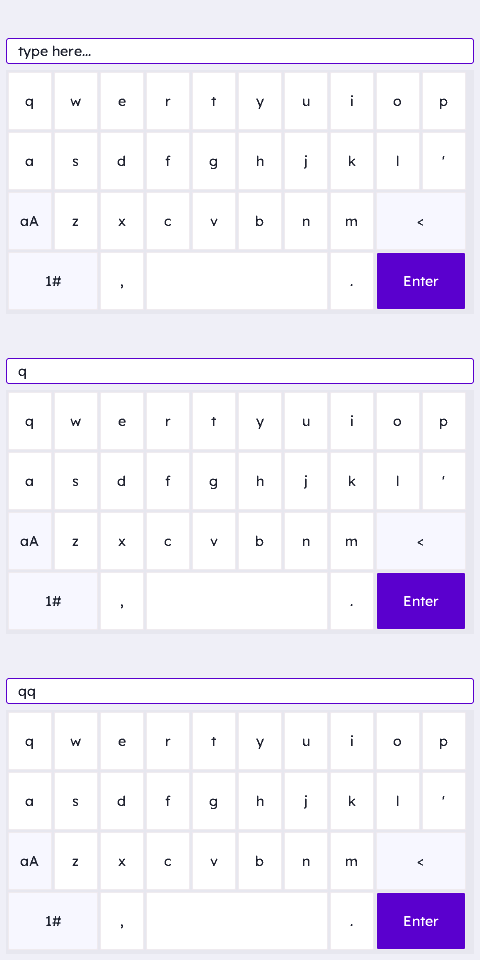 AlphaNum Keyboard WidgetThe AlphaNum keyboard is a full QWERTY text-entry widget — a themed 4×10 key grid across three pages (lower / upper / symbols) for name/label/search …Read the docs →
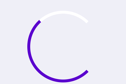 Arc WidgetThe Arc widget draws a ring, or a multi-ring stack, that fills to show a value — a read-only gauge, or (with a callback) a circular slider. Init …Read the docs →
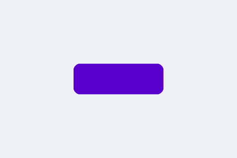 Box WidgetThe Box is μGUI's most fundamental widget — a rounded rectangle that works as a button, a panel, a card, or a container for other widgets. Boxes …Read the docs →
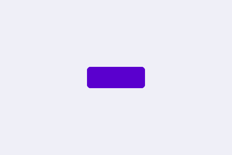 Button WidgetThe Button is functionally identical to the Box — same filled rounded rectangle, same optional border/icon/caption, even the same built-in …Read the docs →
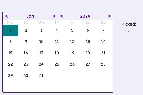 Calendar WidgetThe Calendar is an inline (or modal) month-grid date picker — a header with month/year navigation arrows, a weekday row, and a 6×7 day grid. Init …Read the docs →
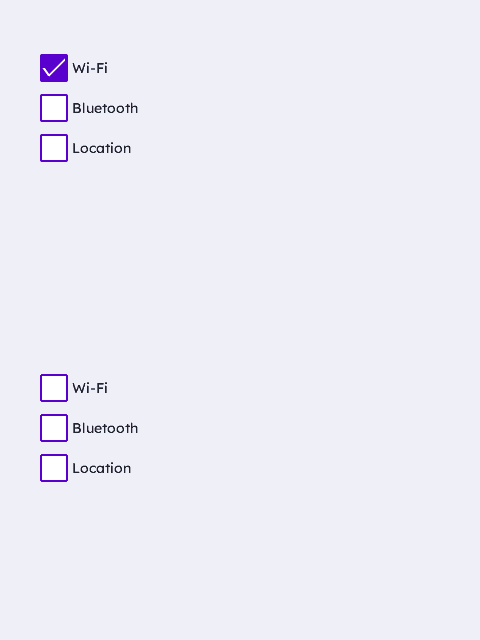 Checkbox WidgetThe Checkbox widget is a labelled boolean toggle. Init installs the whole look (theme-accent box, rounded corners, tick mark) AND a default event …Read the docs →
 Circle WidgetThe Circle widget draws a disc or ring — a status LED, a dot, a bullet, a decorative accent. Init installs a filled theme-accent disc with the radius …Read the docs →
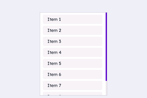 Container WidgetThe Container is the full 2-axis scroll panel — vertical AND horizontal overflow, a bar on either edge as needed, and a built-in keypad model: it is …Read the docs →
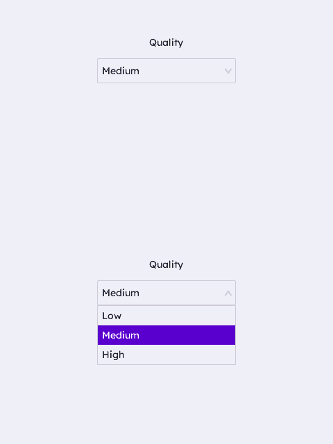 Dropdown WidgetThe Dropdown is a single-select combo box — a themed header row that opens a scrollable overlay list, the compact alternative to a row of radio …Read the docs →
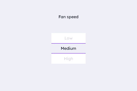 Drum WidgetThe Drum is a kinetic rotary picker — a scrolling belt of items with a centre selection band, the classic "spin to a value" control (time, rate …Read the docs →
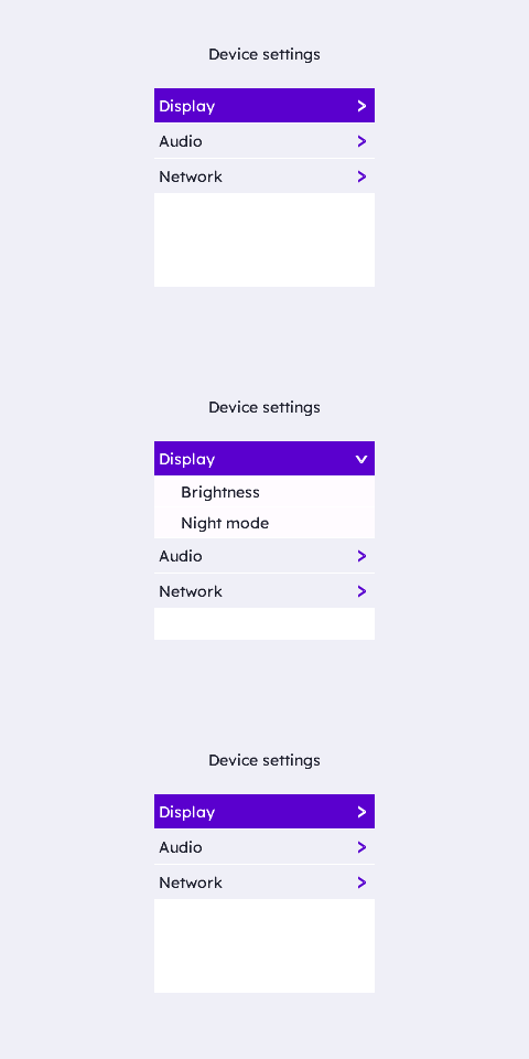 Fold WidgetThe Fold is an accordion / tree menu — collapsible sections with an animated reveal, the shape of a real device settings tree. Init installs the …Read the docs →
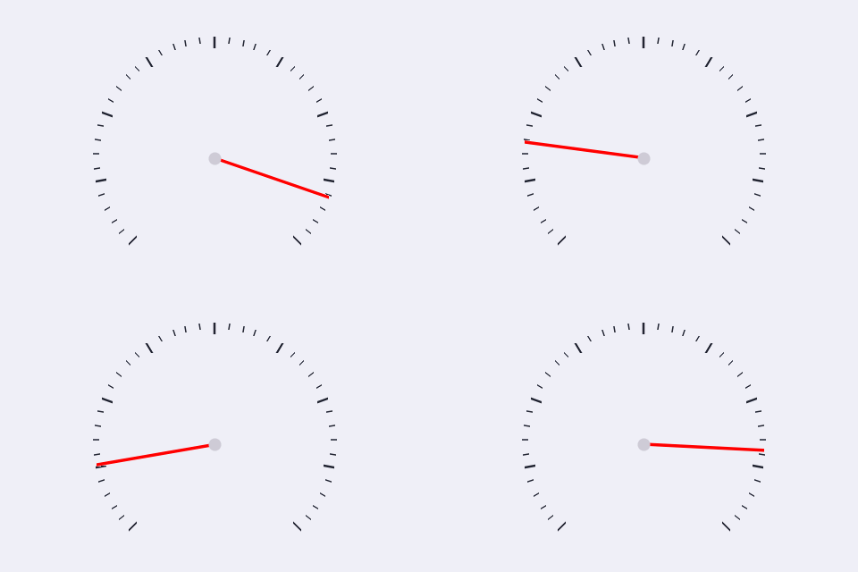 Gauge WidgetThe Gauge is a classic needle dial — automotive speedometer, medical pressure gauge, any instrument reading. Init installs a 270° sweep, ticks, a …Read the docs →
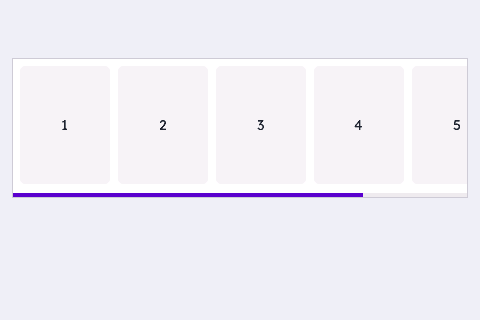 HContainer WidgetThe HContainer is the lean horizontal-scroll container — the mirror of VContainer: horizontal scroll plus a bottom-edge bar, no vertical axis and no …Read the docs →
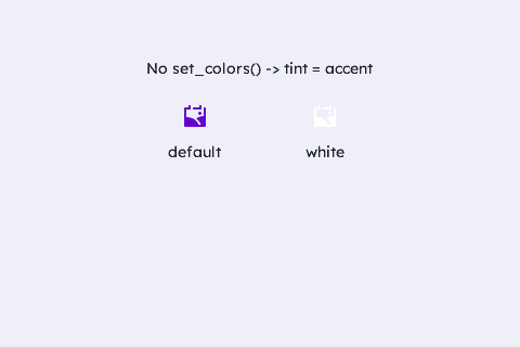 Image WidgetThe Image widget draws a compressed flash asset — an icon, glyph or sprite — the library's answer to "a picture," at a fraction of a raw bitmap's …Read the docs →
 Label WidgetThe Label widget draws text — a caption, a value readout, a status banner. Unlike most widgets it has no default geometry (init() only zeroes the …Read the docs →
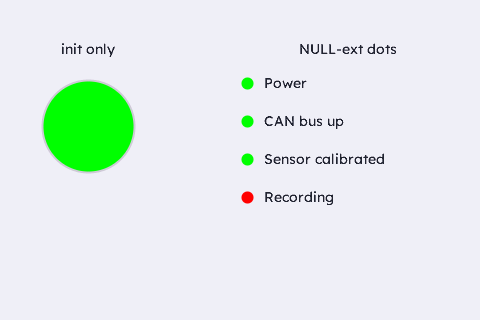 LED WidgetThe LED is a round indicator lamp — a status dot, an annunciator, a panel light. Its lit colour blends with the parent background at a settable …Read the docs →
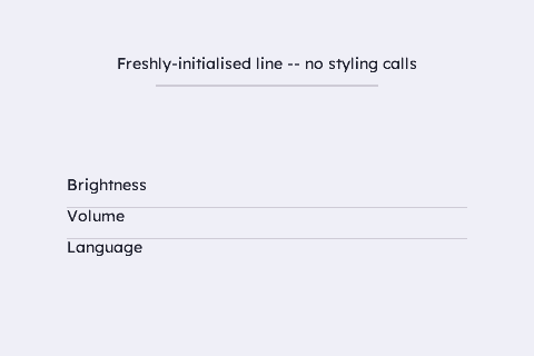 Line WidgetThe Line widget draws a straight stroke — a section divider, a chart axis, a threshold marker, a "muted" cross-out. The widget's box IS the line …Read the docs →
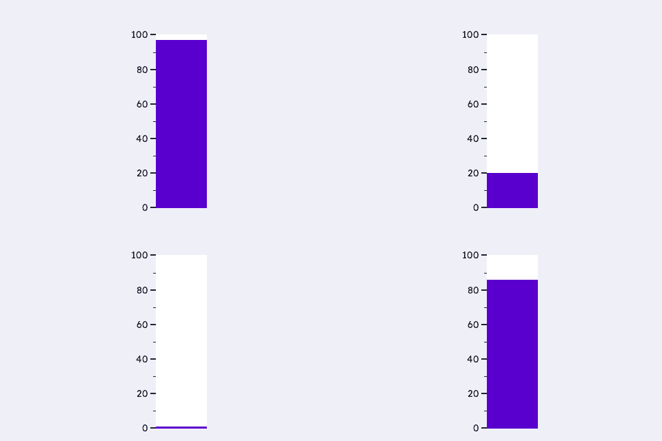 LinGauge WidgetThe LinGauge is a linear instrument — a bar, a segmented LED block readout, or a sliding pointer marker over a track — the horizontal/vertical …Read the docs →
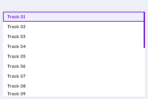 List WidgetThe List is a kinetic scrolling list — a vertically-scrollable, virtual row view with touch inertia, for a long, drag-to-browse collection (a track …Read the docs →
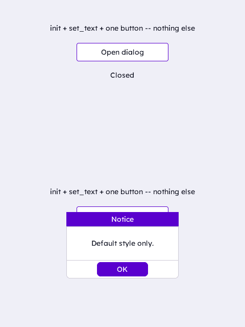 MsgBox WidgetThe MsgBox widget is a modal dialog — an alert, a confirmation, a small popup form. Init installs a theme-tracked panel with title and button bars …Read the docs →
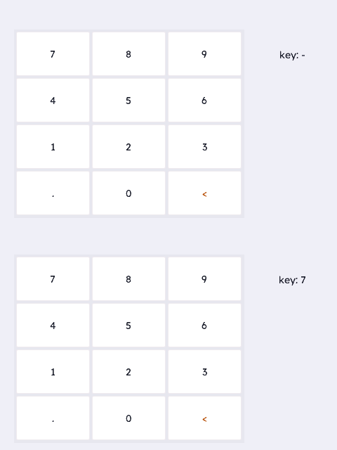 NumPad WidgetThe NumPad is a numeric entry keypad — a themed 4×3 key grid (digits, decimal point, backspace) for rate/dose/setpoint fields. Init installs the …Read the docs →
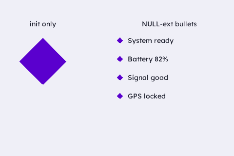 Polygon WidgetThe Polygon widget draws an arbitrary vertex shape — a triangle, a pentagon, a star, an HMI glyph (caution triangle, play/stop, trend arrows, home) …Read the docs →
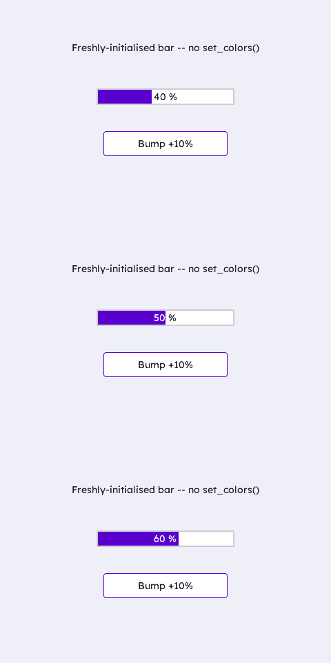 Progress Bar WidgetThe Progress Bar is a filled-track indicator — a percentage readout, a fuel gauge, a system-status meter. Init installs theme-tracked fill/track/ …Read the docs →
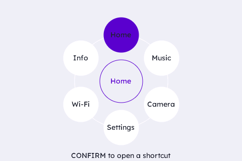 Radial WidgetThe Radial is a radial menu / shortcut hub — a ring of selectable bubbles around a centre hub, for round screens and shortcut launchers. Items are …Read the docs →
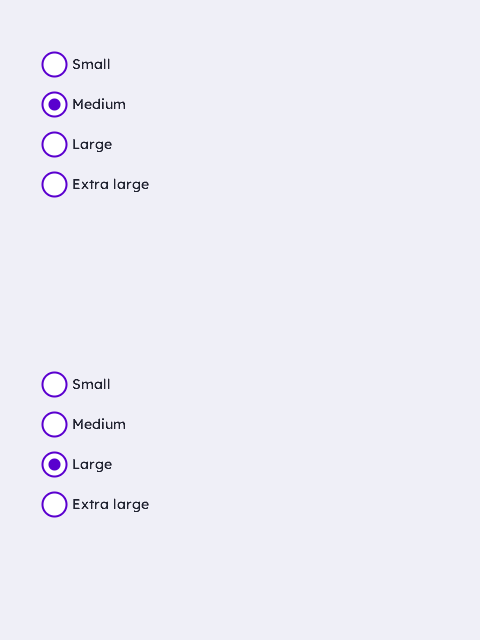 Radio Button WidgetThe Radio Button widget is a labelled, mutually-exclusive selector. Init installs the on-theme look AND a default event mask (group 0), so a fresh …Read the docs →
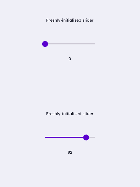 Slider WidgetThe Slider is a draggable value control — a track with a knob, or a min..max RANGE with two knobs. Init installs a theme-tracked 0..100 VALUE slider …Read the docs →
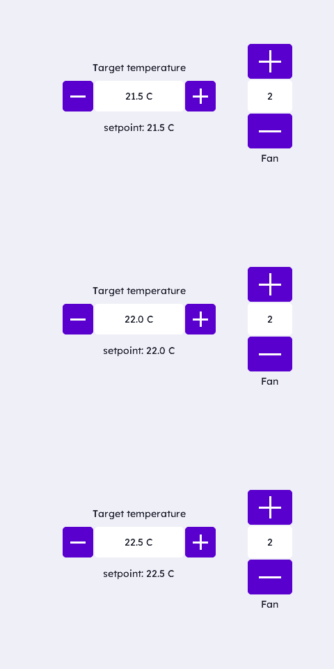 SpinBox WidgetThe SpinBox is a numeric stepper — a themed [-] / value / [+] control for setpoints (rate, temperature, volume) that need to stay in physical units …Read the docs →
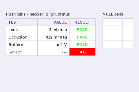 Table WidgetThe Table widget is a data grid — a results report, a live vitals panel, an alarm/event log. Cells are a flat, app-owned array of 8-byte tagged-union …Read the docs →
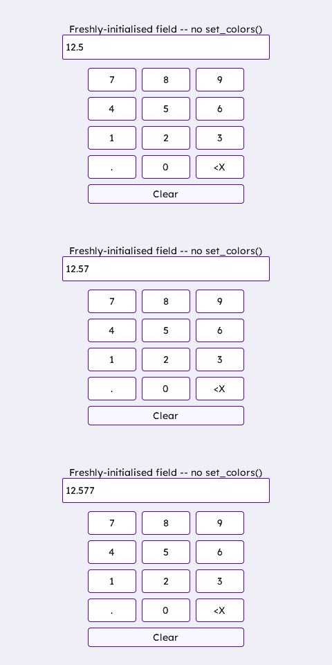 TextEdit WidgetThe TextEdit widget is a single-line input field — a numeric entry, a username, a password. Init installs theme-tracked background/border/cursor …Read the docs →
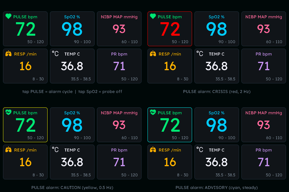 Tile WidgetThe Tile is a dashboard readout card: a themed panel with a big fixed-point value, optional label/limit text, an optional two-frame animated icon …Read the docs →
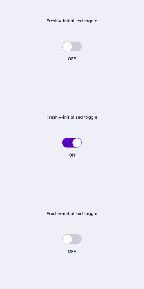 Toggle WidgetThe Toggle is an animated ON/OFF switch — a pill-shaped track with a sliding knob. Init installs a theme-tracked look (a neutral BORDER-coloured OFF …Read the docs →
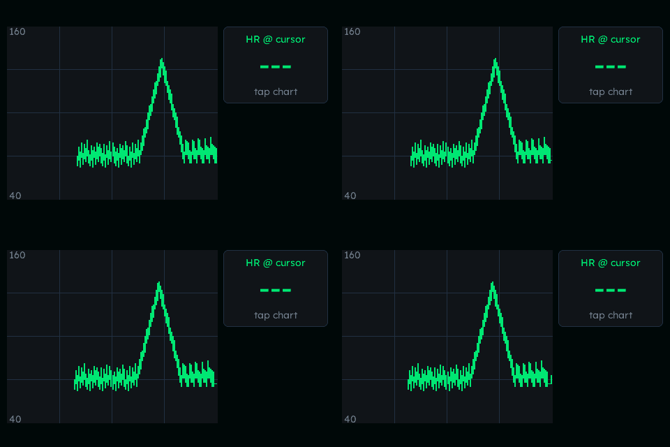 Trend WidgetThe Trend widget is a scrolling min/max-bar or stepped-line chart backed by an app-owned ring buffer of buckets — a patient-monitor trend, a fuel or …Read the docs →
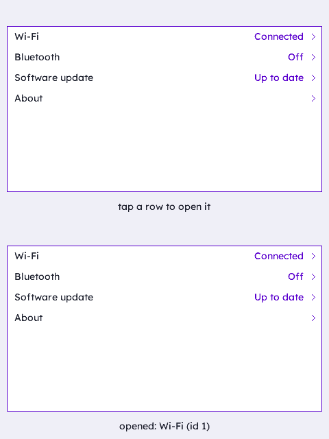 uList WidgetThe uList is a lean, virtual, scrollable list of uniform rows — the small-footprint replacement for the older List (kinetic) and Fold widgets: rows …Read the docs →
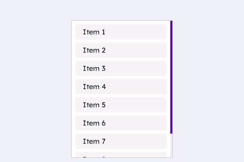 VContainer WidgetThe VContainer is the lean vertical-scroll container: vertical scroll plus a right-edge bar, no horizontal axis and no keypad focus-scope overhead — …Read the docs →
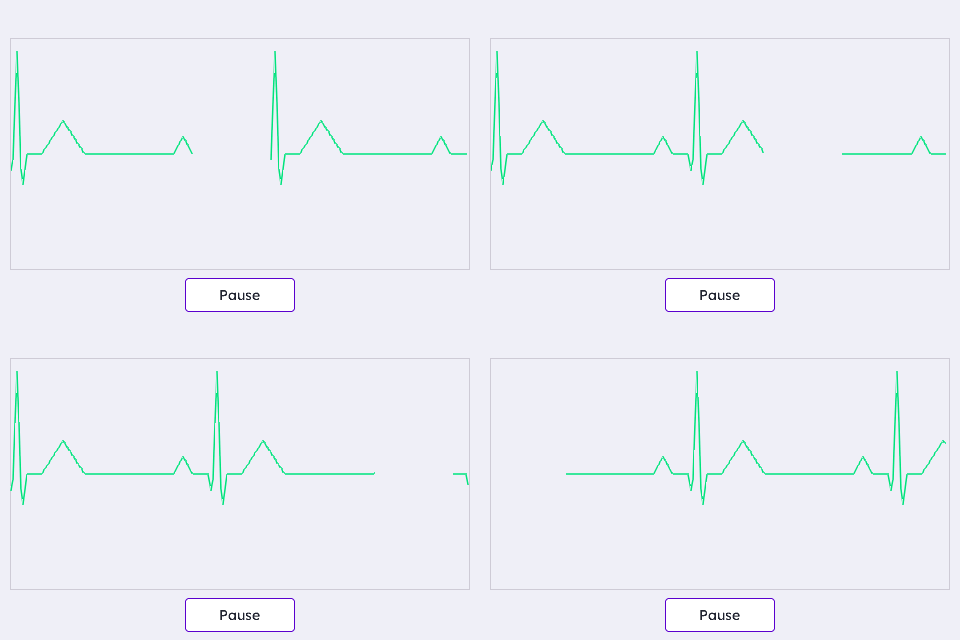 Waveform WidgetThe Waveform widget is a real-time strip-chart / scope plot — one or more scrolling or sweeping traces over a live or historical value buffer, the …Read the docs →
More on the way
Every undocumented family already works — the docs pipeline renders each example straight from the demo gallery, so pages land here as soon as their screenshots are generated.